
"Whereas, the City Council has heretofore appointed a committee to select a flag of the City of Minneapolis; and
"Whereas, the said committee has, after diligent effort, selected a suitable design for such a flag; the design of said flag being as follows:
"A royal blue pennant on a white field or background with a white circle on a blue pennant divided by four parts; each of the four parts of the circle containing a blue symbol, i.e., a building symbolizing education and the arts; a cogged wheel and square symbolizing labor and industry; a pilot wheel symbolizing our lakes and rivers and all activities identified with them; a microscope symbolizing research, skilled craftsmanship and progress – all of these symbols combined point out the beauty, harmony and brilliant future of our City.

"Now, Therefore, Be it Resolved: That the above described design be and is hereby adopted as the Official Flag of the City of Minneapolis and that the original design therefore be filed and kept of record in the Office of the City Clerk as a model to be used and copied by all persons desiring and authorized to reproduce the flag.
"Be It Further Resolved that the City Council of the City of Minneapolis, for itself and on behalf of all the citizens of the City of Minneapolis again express deep appreciation and heartfelt thanks to all persons who contributed to make this project a success."
- Resolution to adopt a new city flag, passed May 27, 1955 by Eugene E. Stokowski, President of the City Council. Presented by Aldermen Earl Johnson and Jack Jorgensen. Judges for the "Flag Contest" included Russell Plimpton, Director of the Minneapolis Institute of Arts, and Mrs. John Rood, member of the Minneapolis Library Board. The winning design was created by Louise Sundin (above), a progressive union leader who went on to head the Minneapolis Federation of Teachers and was voted out as union head just last year.It's not pleasant to admit, but Minneapolis has a pretty awful flag. I'm sure Ms. Sundin meant well -- and judging by her biography, she must have been quite young when she won the contest -- but the fact is, our city flag doesn't really possess any of the qualities that make anyone really

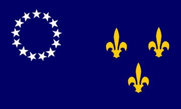
very excited about waving it around. I hadn't been aware that Minneapolis even had a flag until I saw the design for the new Vikings stadium -- there it is to the right, up in the northwest corner, flying alongside the flags of the Vikes, Minnesota and the U.S.A. Where I grew up, in Louisville, the city flag was a source of almost psychotic pride among locals. You saw it flying everywhere when I was growing up; hipsters had it tattooed to their foreams. Rightfully so, too -- it was a
beautiful flag, designed by the Austrian typographer Victor Hammer. It paid homage to the city's French roots with the fleur-dis-lis and its colonial-era origins with the 13 stars. Plus, it was simple enough to reproduce, and all that negative space looked great.
Chicago and
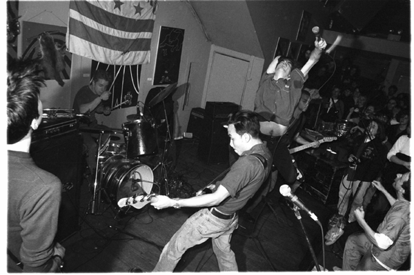
Washington, D.C. have similarly beloved flags that follow a similar principle -- simple without being too literal, too ham-handedly "symbolic," or too awkward (the D.C. flag is put to good use in that link back there by the late-'80s era hardcore troublemakers the Nation of Ulysses). This is where Minneapolis' flag falls short -- I mean, my goodness, a microscope? Right on the flag? Plus, a wheel for a barge? A gear and ruler? A neo-classical building? For a city that spend most of the 1950s and '60s
tearing down its historic architecture, it seems a bit disingenuous to be waving that particular image in people's faces. All four of these icons, artlessly arranged in a four-square pie, don't make a particularly compelling case for the beauty, harmony and brilliant future of a city for me, anyway. You would think we were a city full of barge captains that hang around museums and research laboratories all the time (which, come to think of it, may have seemed reasonable from a branding perspective at the time).
Minneapolis is, after all, a
"design city." There are quite a few
intelligent,
creative individuals here that know their way around a drafting board. It seems like we could do a lot better now. We could start, for example, by making the field more
purple.
I think we could keep the pennant shape, though. I'll give Louise that -- the pennant shape is pretty damn cool.


